Visual guideline
White-label brand bible
Upated on
Intro
Scope
The white-label brand bible aim to unify design of each baseline product and specify rules for each targetted devices.
Main vision is to be simple, beautifull, sustainable, efficient.
Simplicity and clarity words conduct to adopt a flat design mode that could be easily surcharge with more complex visuals for specifics clients' visual identity. A ‘less is more’ approach is given to whole screens and their individual elements
Brand personality has to be the most universal as possible to not disturb readings and cause undesired connotation
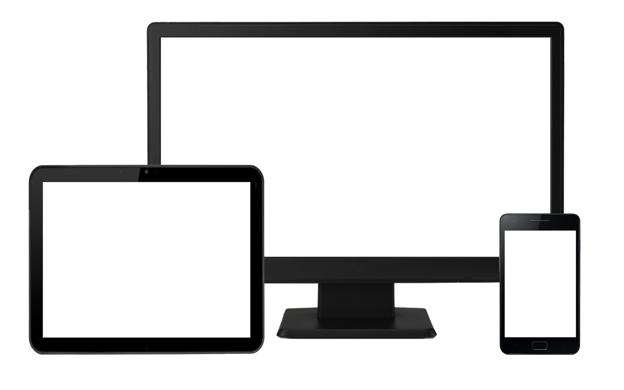
The brand bible has to be responsive across phone, tablet and desktop devices
Using this style guide
Some of the styles presented in this document are not applicable to all platforms and devices. The following icons are used throughout the style guideline to indicate which devices and platforms are being targeted:
- Android application
- Android web browser
- IOS application
- IOS web browser
- Phone
- Tablet
- Desktop
The HTML version of this style guideline is responsive, this means that the rules are apply on itself and is adapt to the correspondng devices according to your browser width.
Authors
- Company: Amadeus Global Travel Distribution
- Department: Airline IT Usability Department
- Contact: Tran Dzien Nguyen - (tnguyen@amadeus.com)
Writings style and voice
The UK style of English is used throughout the site.
- Paragraphs start with a capital letter and finish with a full stop.
- The 12 Nov 2011 date format is used.
- Currency is abbreviated to its 3 letter code. GBP, USD EUR.
- Time is written is the 24 hour format: 23:15.
- Temperature to be displayed in °C & °F.
- The term “passenger“ is used and not “traveller“
- Pronouns and product names have the first letter of each word capitalized. All other text only has the first letter of the first word capitalized.
- Time format: 3 hr 45 mins
Active Mode
Writing in the active voice means constructing sentences where the subject is doing action, Use the active voice when you want your writing to be simple, direct, clear and easy to read.
Sentences written in the active voice are also less wordy than those in the passive voice
Usage
- Button
- Menu
- Aknowledgement
Passive Mode
Using the passive voice can be an excellent way to avoid assigning responsibility for a job or problem. Sometimes this can be a useful and tactful way to phrase things in business writing:
- “Mistakes were made.”
- “The ticket will be sent as soon as possible.”
- The flight have been delayed.”
Usage
- Notification message
- Alert message
Label
Button label
Element triggering an action on a page should explicitly illustrate its action
User often do not read and focused on action items such as button, when using explicit label we ensure that he knows what he will do
Examples
Do not use : but
Do not use : but or
Do not use : but
Use:
Passenger management
You are going to remove a passenger from your flight
Link label
Same as for buttons link label should be explicit and be itself a sentences or be mixed in a sentence
Link are @blue and underline on rollover: this is a link
Rollover link are @blueDark
Visited link are @gray
Active link are @blueDark
Typography
The font use is the Roboto provide by google for android device.
| font-family | Roboto 400 | ||
|---|---|---|---|
| margin-botton | 5px | 10px | 20px |
| font-size | 14px | 14px | 13px |
| line-height | 33px | 33px | 20px |
Title
Level 1
| font-family | Roboto 700 @blue | ||
|---|---|---|---|
| margin | 10px 0 | 15px 0 | 20px 0 |
| font-size | 25px | 25px | 23px |
| line-height | 25px | 25px | 23px |
Level 2
| font-family | Roboto 300 @blue | ||
|---|---|---|---|
| margin | 10px 0 | 15px 0 | 20px 0 |
| font-size | 22px | 22px | 21px |
| line-height | 25px | 25px | 23px |
Level 3
| font-family | Roboto 700 @blue | ||
|---|---|---|---|
| margin | 10px 0 | 15px 0 | 20px 0 |
| font-size | 20px | 20px | 18px |
| line-height | 25px | 25px | 23px |
Level 4
| font-family | Roboto 700 @blue | ||
|---|---|---|---|
| margin | 10px 0 | 15px 0 | 20px 0 |
| font-size | 18px | 18px | 16px |
| line-height | 20px | 20px | 20px |
Level 5
| font-family | Roboto 700 @blue | ||
|---|---|---|---|
| margin | 3px 0 | 5px 0 | 10px 0 |
| font-size | 15px | 15px | 14px |
| line-height | 20px | 20px | 20px |
Level 6
| font-family | Roboto 700 @blue | ||
|---|---|---|---|
| margin | 3px 0 | 5px 0 | 10px 0 |
| font-size | 14px | 14px | 13px |
| line-height | 20px | 20px | 20px |
Header
Level 1
Level 2
Level 3 Inside a header > margin : 0
...
Paragraph
DEFAULT
Lorem ipsum dolor sit amet, consectetur adipisicing elit, sed do eiusmod tempor incididunt ut labore et dolore magna aliqua. Ut enim ad minim veniam, quis nostrud exercitation ullamco laboris nisi ut aliquip ex ea commodo consequat. Duis aute irure dolor in reprehenderit in voluptate velit esse cillum dolore eu fugiat nulla pariatur. Excepteur sint occaecat cupidatat non proident, sunt in culpa qui officia deserunt mollit anim id est laborum.
| font-family | Roboto 400 @grayDarker | ||
|---|---|---|---|
| margin | 10px 0 | 15px 0 | 20px 0 |
| font-size | 14px | 14px | 13px |
| line-height | 27px | 27px | 20px |
ITALIC
Lorem ipsum dolor sit amet, consectetur adipisicing elit, sed do eiusmod tempor incididunt ut labore et dolore magna aliqua. Ut enim ad minim veniam, quis nostrud exercitation ullamco laboris nisi ut aliquip ex ea commodo consequat. Duis aute irure dolor in reprehenderit in voluptate velit esse cillum dolore eu fugiat nulla pariatur. Excepteur sint occaecat cupidatat non proident, sunt in culpa qui officia deserunt mollit anim id est laborum.
| font-family | Roboto 400 italic @grayDarker | ||
|---|---|---|---|
| margin | 10px 0 | 15px 0 | 20px 0 |
| font-size | 14px | 14px | 13px |
| line-height | 27px | 27px | 20px |
STRONG
Lorem ipsum dolor sit amet, consectetur adipisicing elit, sed do eiusmod tempor incididunt ut labore et dolore magna aliqua. Ut enim ad minim veniam, quis nostrud exercitation ullamco laboris nisi ut aliquip ex ea commodo consequat. Duis aute irure dolor in reprehenderit in voluptate velit esse cillum dolore eu fugiat nulla pariatur. Excepteur sint occaecat cupidatat non proident, sunt in culpa qui officia deserunt mollit anim id est laborum.
| font-family | Roboto 700 @grayDarker | ||
|---|---|---|---|
| margin | 10px 0 | 15px 0 | 20px 0 |
| font-size | 14px | 14px | 13px |
| line-height | 27px | 27px | 20px |
EMPHASIS
Lorem ipsum dolor sit amet, consectetur adipisicing elit, sed do eiusmod tempor incididunt ut labore et dolore magna aliqua. Ut enim ad minim veniam, quis nostrud exercitation ullamco laboris nisi ut aliquip ex ea commodo consequat. Duis aute irure dolor in reprehenderit in voluptate velit esse cillum dolore eu fugiat nulla pariatur. Excepteur sint occaecat cupidatat non proident, sunt in culpa qui officia deserunt mollit anim id est laborum.
| font-family | Roboto 700 italic @grayDarker | ||
|---|---|---|---|
| margin | 10px 0 | 15px 0 | 20px 0 |
| font-size | 14px | 14px | 13px |
| line-height | 27px | 27px | 20px |
SMALL
Lorem ipsum dolor sit amet, consectetur adipisicing elit, sed do eiusmod tempor incididunt ut labore et dolore magna aliqua. Ut enim ad minim veniam, quis nostrud exercitation ullamco laboris nisi ut aliquip ex ea commodo consequat. Duis aute irure dolor in reprehenderit in voluptate velit esse cillum dolore eu fugiat nulla pariatur. Excepteur sint occaecat cupidatat non proident, sunt in culpa qui officia deserunt mollit anim id est laborum.
| font-family | Roboto 300 @grayDarker | ||
|---|---|---|---|
| margin | 10px 0 | 15px 0 | 20px 0 |
| font-size | 12px | 12px | 12px |
| line-height | 27px | 27px | 20px |
Panel (specific case)
Panel title
Panel header content
| font-family | Roboto 300 @white | ||
|---|---|---|---|
| background | @blue | ||
| font-size | 21px | 21px | 20px |
| line-height | 25px | 25px | 23px |
Level 1
Level 2
Level 3
Level 4
Level 5
Level 6
Panel content
Layout
Devices
This guideline focus on IOS and android operating system, but should be applied as much as possible to all type of systems.
Main visual distinction is about screen size separate in 3 category: phone , tablet and desktop .
- phone: from 320px width to 768px width
- tablet: from 768px width to 1280px width
- desktop: from 1280px width to 1600px width
The minimum targeted screen size on desktop is 1280px width by 768px height. The maximum targeted screen width on desktop is 1600px in date of June 2013
The minimum targeted screen height on mobile is 480px in date of June 2013 the
Structure
Layout is composed of 4 main parts:
-
Main menu
First level menu in general on top of the page, it allow exploring the website main content
-
Navigation menu
Specific part containing the main button to navigate throught a flow of pages
-
Sub-navigation menu
Page summary generally made with anchor
-
Contextual menu
Menu specific for an action to do in few steps
-
Personnal menu
Action summary and information such as shopping basket
-
Content
The main content of a page
Phone
Tablet
Desktop
Panel
| margin | 5px | 10px | 20px |
|---|
Panel title margin: 0
Panel header content margin: 0
| padding | 5px | 7.5px | 10px |
|---|
Level 1 First-child > margin-top: 0
Content
| padding | 5px | 7.5px | 10px |
|---|
Module
Logo
The white-label logo is the Amadeus 'a' icon.
| height | 50px | 67px | 67px |
|---|---|---|---|
| width | 32px | 42px | 42px |
Colors
Colors used are based on Amadeus graphic guide
- @blue
- @green
- @magenta
Color swatches
- @blue
- @blueDark
- @blueDarker
- @blueLight
- @blueLighter
- @blueLighten
- @green
- @greenDark
- @greenDarker
- @greenLight
- @greenLighter
- @greenLighten
- @magenta
- @magentaDark
- @magentaDarker
- @magentaLight
- @magentaLighter
- @magentaLighten
- @gray
- @grayDark
- @grayDarker
- @grayLight
- @grayLighter
- @grayLighten
Other color
- @yellow
- @yellowDark
- @yellowDarker
- @yellowLight
- @yellowLighter
- @yellowLighten
- @red
- @redDark
- @redDarker
- @redLight
- @redLighter
- @redLighten
Icons
Icon are font characters also called glyph
Examples
- home icon
- plane icon
- edit icon
- phone icon
Icon list
Image
Banner
Banner picture are full width
Portrait
Portrait picture are surounded with a white space of 4px and an 1px border @grayLight
Examples
 Portrait of Samuel Chueng
Button
Common buttons
Navigation buttons
Primary buttons
Default buttons
Small buttons
Buttons with icon only
Specific buttons
Trigger
Altermative button
Switch
Increment
Dropdown
Group
Pagination
Pager
Input
Input
Text input
Autocomplete
Select
Enhanced input
.00
$
.00
Component
Panel
Panel title
Panel header content
Level 1
Level 1
Level 1
Level 1
Level 1
Level 1
Panel content
Panel collapsable
Panel with toolsbox and aside content
Content
- list item
- list item
- list item
Panel with inner pager
Content
- list item
- list item
- list item
Message, popup and dialog
Message
Title, This is a information message.
Title, This is a warning message.
Title, This is a error message.
Title, This is a success message.
Dialog
Modal title
Some text about the action to do
Popover
Popover top
Sed posuere consectetur est at lobortis. Aenean eu leo quam. Pellentesque ornare sem lacinia quam venenatis vestibulum.
Popover right
Sed posuere consectetur est at lobortis. Aenean eu leo quam. Pellentesque ornare sem lacinia quam venenatis vestibulum.
Popover left
Sed posuere consectetur est at lobortis. Aenean eu leo quam. Pellentesque ornare sem lacinia quam venenatis vestibulum.
Alert
Gate has changed for SQ 1234
Lorem ipsum dolor sit amet, consectetur adipiscing elit: gate 54.
Lorem ipsum dolor sit amet, consectetur adipiscing elit. Integer tristique, enim a cursus venenatis, ipsum turpis iaculis mi, ut scelerisque nunc massa non enim. Nulla facilisi. Nullam sollicitudin nec nisl quis blandit. In porttitor nulla eget nunc vestibulum vehicula. Nulla elementum eros eu nisl pretium, ut pretium lacus ultrices. Nam a dolor eget urna congue suscipit. Vestibulum ornare urna eu magna eleifend, a porttitor elit aliquet. In pellentesque ac erat a vulputate. Nulla et nisl in velit sagittis semper nec vel lacus. Sed pellentesque neque vitae sollicitudin blandit.
Flight cancelled
Flight SQ 1234 is cancelled because of an engine avary.
Lorem ipsum dolor sit amet, consectetur adipiscing elit. Integer tristique, enim a cursus venenatis, ipsum turpis iaculis mi, ut scelerisque nunc massa non enim. Nulla facilisi. Nullam sollicitudin nec nisl quis blandit. In porttitor nulla eget nunc vestibulum vehicula. Nulla elementum eros eu nisl pretium, ut pretium lacus ultrices. Nam a dolor eget urna congue suscipit. Vestibulum ornare urna eu magna eleifend, a porttitor elit aliquet. In pellentesque ac erat a vulputate. Nulla et nisl in velit sagittis semper nec vel lacus. Sed pellentesque neque vitae sollicitudin blandit.
Things to do
- First thing to do
Nam a dolor eget urna congue suscipit. Vestibulum ornare urna eu magna eleifend, a porttitor elit aliquet.
- Second thing to do
Nam a dolor eget urna congue suscipit. Vestibulum ornare urna eu magna eleifend, a porttitor elit aliquet.
- Third thing to do
Nam a dolor eget urna congue suscipit. Vestibulum ornare urna eu magna eleifend, a porttitor elit aliquet.
Your baggage has been found
Your baggage lost is waiting for you in the register desk.
Lorem ipsum dolor sit amet, consectetur adipiscing elit. Integer tristique, enim a cursus venenatis, ipsum turpis iaculis mi, ut scelerisque nunc massa non enim. Nulla facilisi. Nullam sollicitudin nec nisl quis blandit. In porttitor nulla eget nunc vestibulum vehicula. Nulla elementum eros eu nisl pretium, ut pretium lacus ultrices. Nam a dolor eget urna congue suscipit. Vestibulum ornare urna eu magna eleifend, a porttitor elit aliquet. In pellentesque ac erat a vulputate. Nulla et nisl in velit sagittis semper nec vel lacus. Sed pellentesque neque vitae sollicitudin blandit.
Things to do
- First thing to do
Nam a dolor eget urna congue suscipit. Vestibulum ornare urna eu magna eleifend, a porttitor elit aliquet.
- Second thing to do
Nam a dolor eget urna congue suscipit. Vestibulum ornare urna eu magna eleifend, a porttitor elit aliquet.
- Third thing to do
Nam a dolor eget urna congue suscipit. Vestibulum ornare urna eu magna eleifend, a porttitor elit aliquet.
Miscelaneous
Progress bar
Slider
Tineline
NCE
FRA
FRA
SIN
Accordion
Anim pariatur cliche reprehenderit, enim eiusmod high life accusamus terry richardson ad squid. 3 wolf moon officia aute, non cupidatat skateboard dolor brunch. Food truck quinoa nesciunt laborum eiusmod. Brunch 3 wolf moon tempor, sunt aliqua put a bird on it squid single-origin coffee nulla assumenda shoreditch et. Nihil anim keffiyeh helvetica, craft beer labore wes anderson cred nesciunt sapiente ea proident. Ad vegan excepteur butcher vice lomo. Leggings occaecat craft beer farm-to-table, raw denim aesthetic synth nesciunt you probably haven't heard of them accusamus labore sustainable VHS.
Anim pariatur cliche reprehenderit, enim eiusmod high life accusamus terry richardson ad squid. 3 wolf moon officia aute, non cupidatat skateboard dolor brunch. Food truck quinoa nesciunt laborum eiusmod. Brunch 3 wolf moon tempor, sunt aliqua put a bird on it squid single-origin coffee nulla assumenda shoreditch et. Nihil anim keffiyeh helvetica, craft beer labore wes anderson cred nesciunt sapiente ea proident. Ad vegan excepteur butcher vice lomo. Leggings occaecat craft beer farm-to-table, raw denim aesthetic synth nesciunt you probably haven't heard of them accusamus labore sustainable VHS.
Anim pariatur cliche reprehenderit, enim eiusmod high life accusamus terry richardson ad squid. 3 wolf moon officia aute, non cupidatat skateboard dolor brunch. Food truck quinoa nesciunt laborum eiusmod. Brunch 3 wolf moon tempor, sunt aliqua put a bird on it squid single-origin coffee nulla assumenda shoreditch et. Nihil anim keffiyeh helvetica, craft beer labore wes anderson cred nesciunt sapiente ea proident. Ad vegan excepteur butcher vice lomo. Leggings occaecat craft beer farm-to-table, raw denim aesthetic synth nesciunt you probably haven't heard of them accusamus labore sustainable VHS.
-
Departure NCE - SIN on
-
Return SIN - NCE on
-
Passengers
-
Payment
-
Anim pariatur cliche reprehenderit, enim eiusmod high life accusamus terry richardson ad squid. 3 wolf moon officia aute, non cupidatat skateboard dolor brunch. Food truck quinoa nesciunt laborum eiusmod. Brunch 3 wolf moon tempor, sunt aliqua put a bird on it squid single-origin coffee nulla assumenda shoreditch et. Nihil anim keffiyeh helvetica, craft beer labore wes anderson cred nesciunt sapiente ea proident. Ad vegan excepteur butcher vice lomo. Leggings occaecat craft beer farm-to-table, raw denim aesthetic synth nesciunt you probably haven't heard of them accusamus labore sustainable VHS.
-
Total EUR 650
Visual examples
Layout only
Flows
Updates
-
- Julien Aramino
Draft version
No versionning will be done until this document get finalised
Phone
Tablet
Desktop